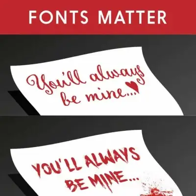
Choosing the right font is an essential aspect of creating a visually appealing and effective website or document. The font you choose can influence how people perceive your message, so it’s important to choose carefully. In this blog, we’ll explore the why font selection matters and the difference between a font and a typeface.
The term “typeface” refers to the design of the characters that make up a particular set of letters, numbers, and symbols. A typeface is the visual representation of a particular style of writing, and it includes details like the size, weight, and shape of each character.
A font, on the other hand, is a particular instance of a typeface. It refers to the specific digital file that contains the information needed to display a particular typeface on a computer screen or in print. A font includes information about the size, weight, and style of the characters, as well as information about how the characters are spaced and positioned on the page.
For example, Helvetica is a typeface and Helvetica Extra Light is a font
“You can say, “I love you,” in Helvetica. And you can say it with Helvetica Extra Light if you want to be really fancy. Or you can say it with the Extra Bold if it’s really intensive and passionate, you know, and it might work.”
Massimo Vignelli

Font selection is important for several reasons. First, the font you choose can influence the readability of your text. Fonts with small or intricate characters may be difficult to read, especially at smaller sizes. Conversely, fonts with large and simple characters may be more readable, especially at larger sizes.
Second, the font you choose can influence the tone and style of your message. Serif fonts, for example, are often associated with more formal or traditional styles of communication, while sans-serif fonts are often associated with more modern or informal styles. Choosing the right font can help you convey the tone and style that you want to communicate to your audience.
Finally, the font you choose can impact the overall visual appeal of your design. Fonts that are poorly chosen or poorly executed can make your design look amateurish or unprofessional. Conversely, a well-chosen font can enhance the visual appeal of your design and help it stand out from the crowd.
When choosing a font for your project, there are several factors to consider. Here are some tips to help you choose the right font:
Font selection is an important aspect of creating a visually appealing and effective design. By considering your audience, message, readability, contrast, and legibility, you can choose a font that enhances the visual appeal of your design and helps you communicate your message effectively. Remember, the font you choose can influence how people perceive your message, so choose carefully!
If you need help with font selection, let’s chat!